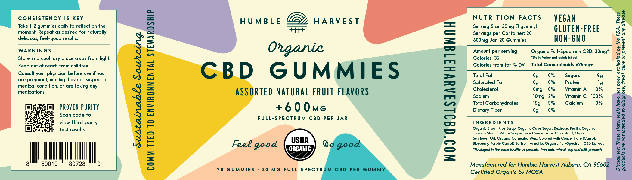
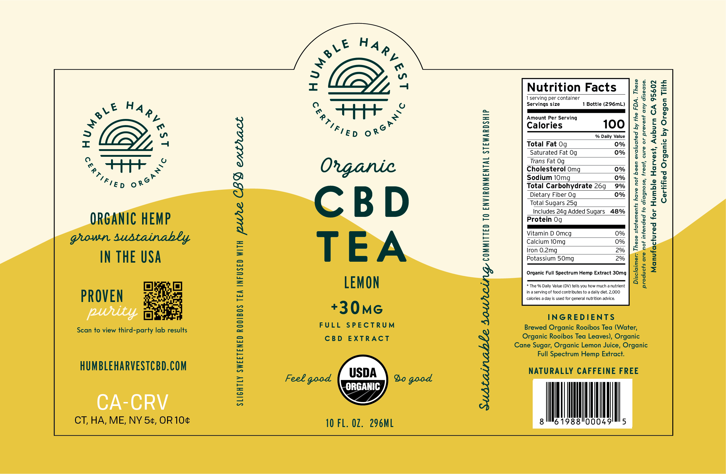
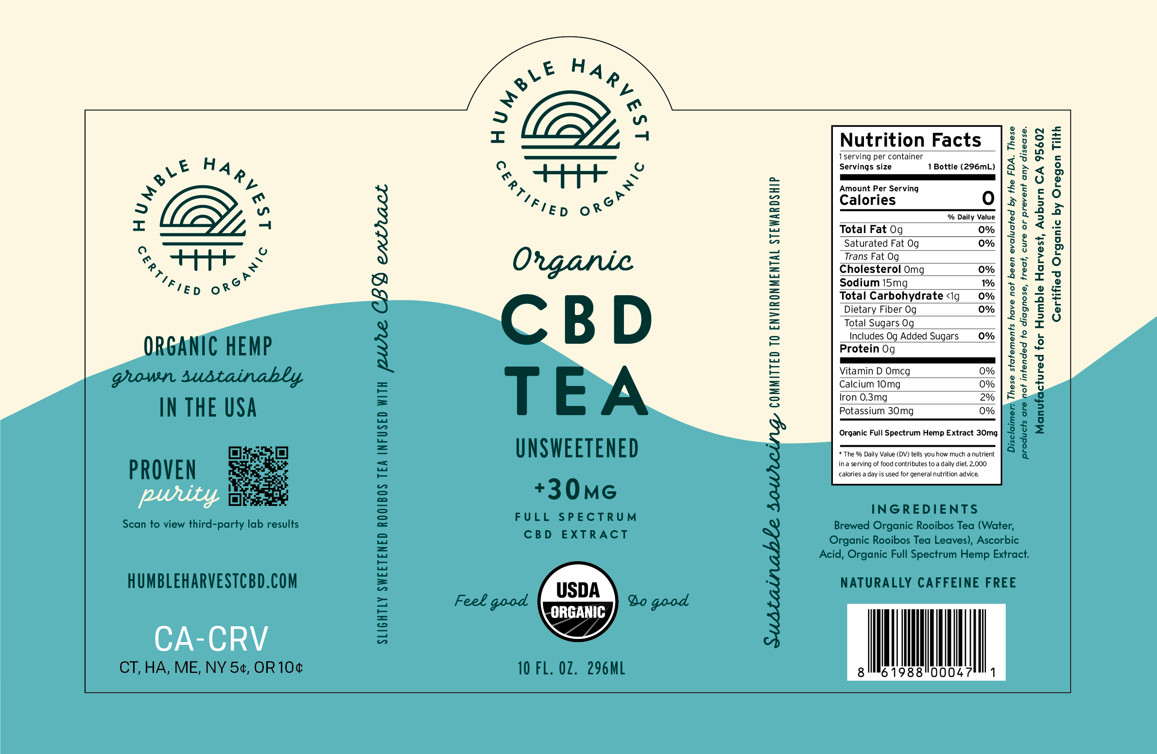
Humble Harvest | Logo, Packaging, & Copy | Role: Contracted Designer | Agency: Take Hold
Feel good, do good.

Humble Harvest is a Humboldt County-based start up focused on making the benefits of organic, biodynamically farmed CBD accessible to even the most canna-phobic households.
Background
Cait Burns at Take Hold approached me to create a logo and some packaging for Humble Harvest’s pitch decks back in 2018. They had an all-star team, a name, and an idea to create a more accessible brand with American-grown CBD teas — but everything else was TBD.
During the process of figuring out exactly what Humble Harvest’s UVP should be, Cait fostered a connection with a biodynamic, organic hemp farm. This partnership gave us something concrete to latch onto: organic sustainability.

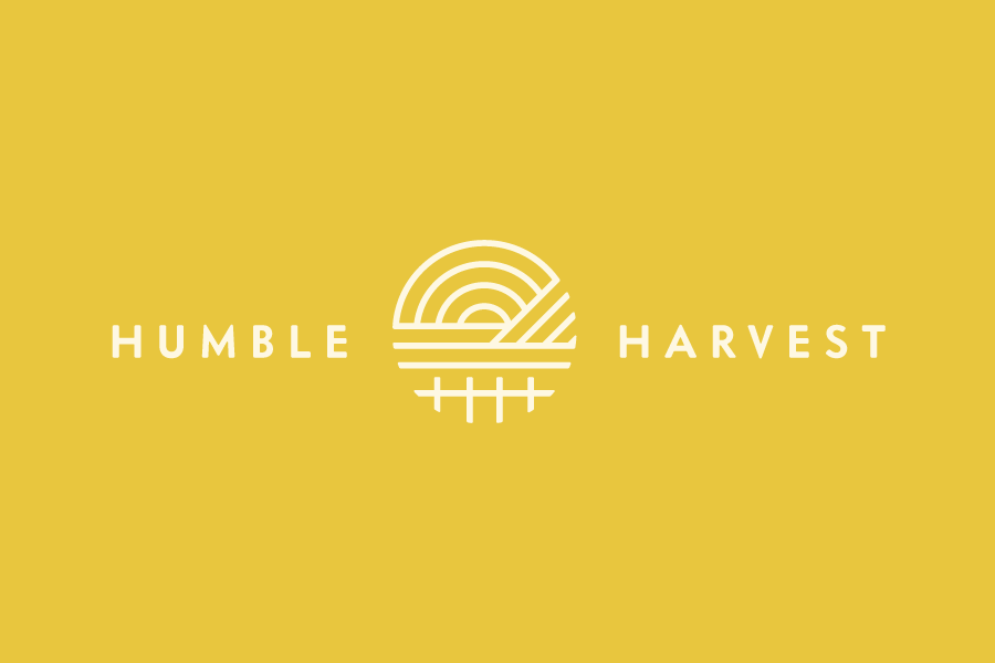
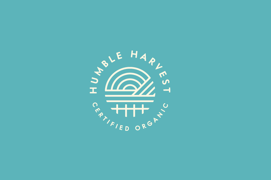
Logomark
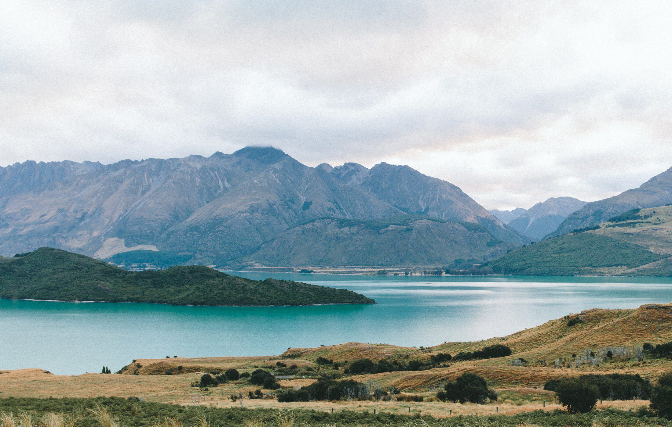
I took inspiration for the logo from Humboldt County’s steep cliffs, expansive coastlines, and beautiful sunsets. The fence in the foreground combines the idea of a farm, with the initials of the company.
Each element is intended to correspond to an area that CBD can benefit. Sky=Mind, Earth=Body, Water=Spirit. These correlations show up in Humble Harvest’s language.